Best Colours for Small Bedrooms: Real Data from 500+ People’s First Impressions
My father thought I was overthinking colour choices.
“Just paint it white like hotels do,” he said. “Guests don’t care about colour—they care about cleanliness and comfort.”
So he designed his first Airbnb property with practical neutrality: white walls, grey systemic closets, random furniture in whatever colours were cheapest that week. A very bright red plastic IKEA chair paired with a mustard yellow sofa, because both were on sale.
His booking rate? 53% occupancy at $40/night.
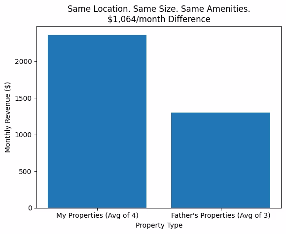
Meanwhile, my first property—designed with an intentionally curated neutral cosy palette of ivory, dusty pink, beige, and brown—hit 90% occupancy at $85/night.
Same building. Same square footage. Same amenities. The only significant difference? Colour psychology and intentional palette curation.
After hosting 500+ guests across 5 properties with wildly different colour schemes, I’ve learned that colour choices directly impact booking rates, guest reviews, and your ability to charge premium prices. This isn’t about personal preference or trendy aesthetics—it’s about understanding how colour affects human psychology, photography, and perceived value.
I’m a former Airbnb Superhost who maintained 85-90% occupancy rates in locations with zero tourist attractions. I’ve tested everything from neutral cosy palettes to bold mid-century modern colour blocking to soft monochrome schemes. I’ve also watched my father learn expensive lessons about what happens when you ignore colour cohesion.
Here’s what actually works when choosing colours for small bedrooms—backed by real booking data, guest feedback, and the mistakes that cost my father $8,760 in Year 1 revenue.
TThe Data: How Colour Schemes Affected Booking Rates
I tracked booking performance across my 4 properties and my father’s 3 properties over 18 months. All properties were in the same general area, similar square footage (300-400 sq ft), and comparable pricing strategies.
My Properties (Intentional Colour Palettes):
Property #1 – Purple Accent Lighting + Modern Neutrals (White/Purple/Black/Green)
- Occupancy: 92%
- Average nightly rate: $86
- Monthly revenue: ~$2,375
- Guest review themes: “unique,” “loved the purple,” “Instagram-worthy,” “so cool”
- Special note: Guest chose this property specifically for birthday because she “loved purple”
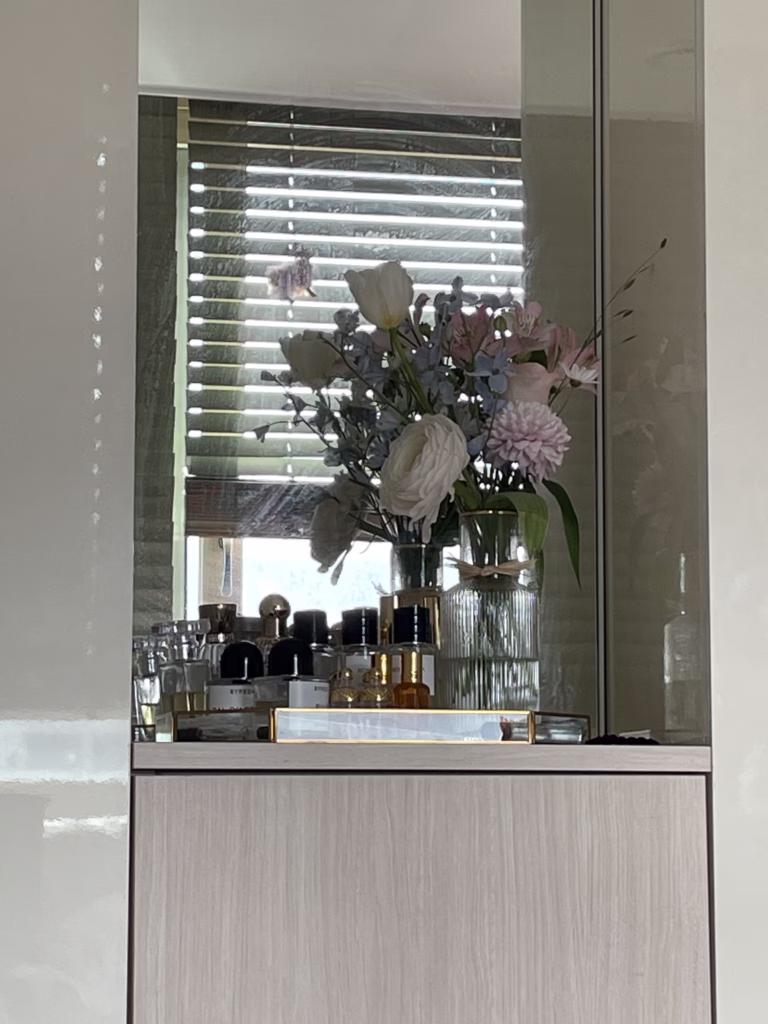
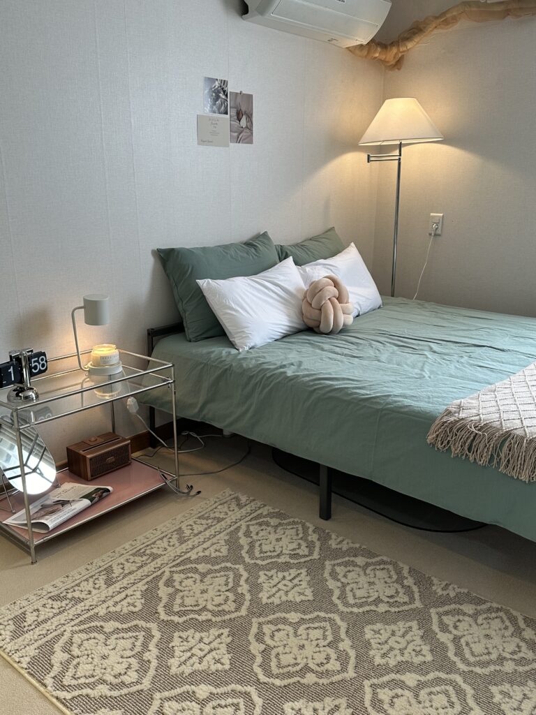
Property #2 – Neutral Cozy (Ivory/Dusty Pink/Beige/Brown)
- Occupancy: 94%
- Average nightly rate: $88
- Monthly revenue: ~$2,483
- Guest review themes: “calming,” “cohesive,” “beautifully styled,” “so cozy”
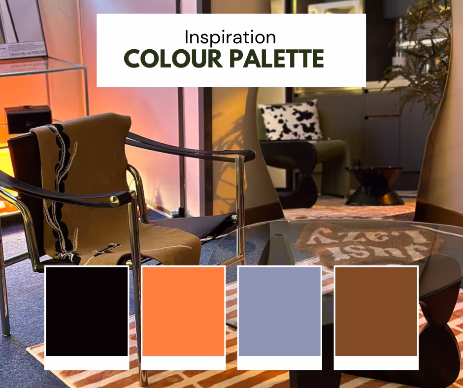
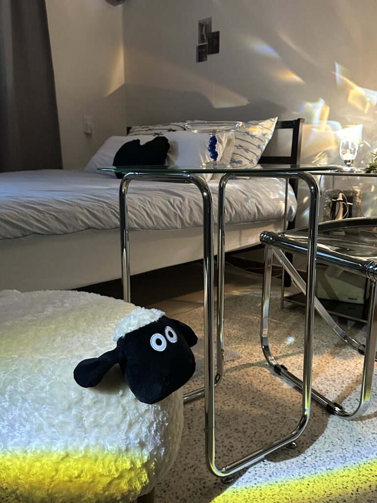
Property #3 – Navy Carpet + Orange Accent (Navy/Orange/Chrome/Green)
- Occupancy: 91%
- Average nightly rate: $85
- Monthly revenue: ~$2,323
- Guest review themes: “fun,” “character,” “stylish,” “unique design”
Property #4 – Pastel Blue Serenity (Pastel Blue/White/Black/Silver)
- Occupancy: 90%
- Average nightly rate: $84
- Monthly revenue: ~$2,268
- Guest review themes: “peaceful,” “calming,” “slept so well,” “clean and modern”
My Father’s Properties (Random “Practical” Colours):
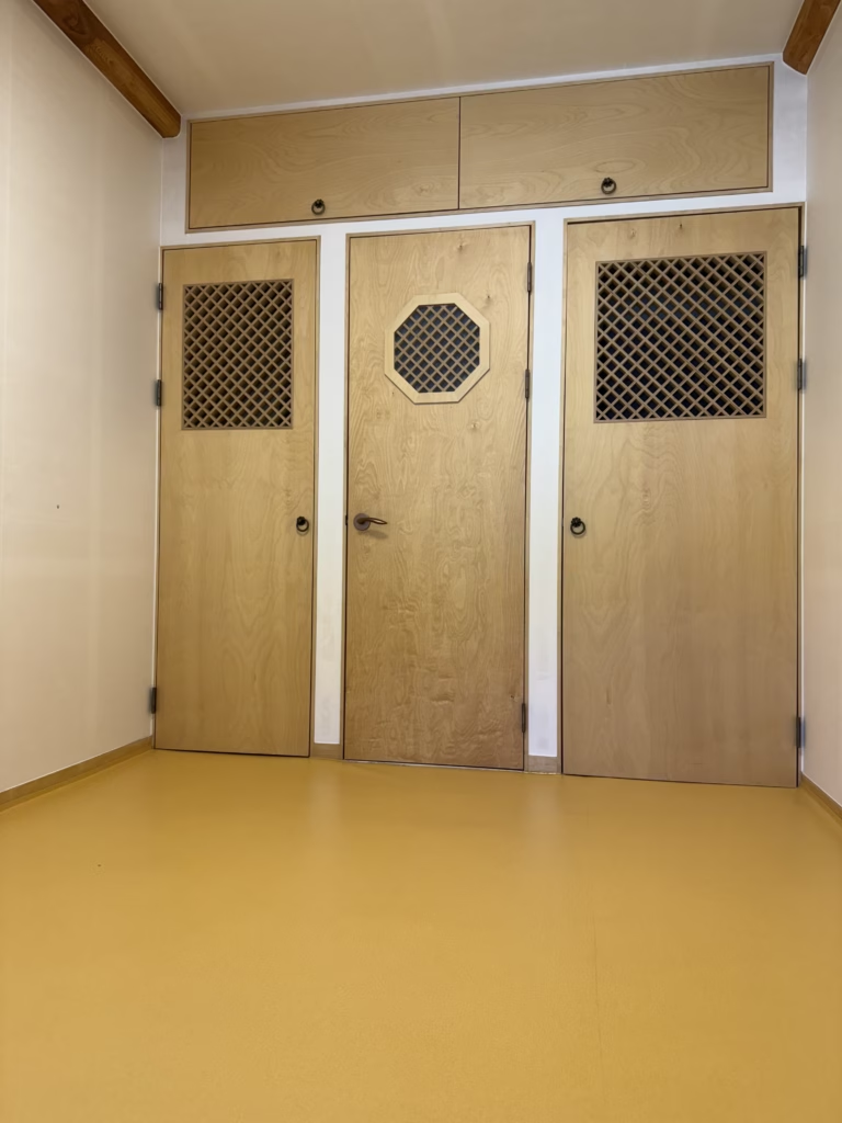
Father’s Property #1 – “Hotel White” Theme (White walls/Grey closets/Random furniture)
- Occupancy: 65%
- Average nightly rate: $70
- Monthly revenue: ~$1,365
- Guest review themes: “clean,” “functional” (no aesthetic mentions)
Father’s Property #2 – Budget Mix (Whatever was cheapest)
- Bright red plastic chair + mustard sofa + wooden floor
- Occupancy: 60%
- Average nightly rate: $68
- Monthly revenue: ~$1,224
- Guest review themes: Sparse reviews, no repeat bookings
Father’s Property #3 – Random Grey + Beige Mismatch
- Cool grey closets + random beige furniture (undertones fighting)
- Occupancy: 63%
- Average nightly rate: $69
- Monthly revenue: ~$1,304
- Guest review themes: “Basic,” “served its purpose”
The Math:
My average property: $2,362/month (across 4 properties)
Father’s average property: $1,298/month (across 3 properties)
Difference: $1,064/month per property = $12,768/year per property
Total portfolio comparison:
- My 4 properties total monthly revenue: ~$9,449
- His 3 properties total monthly revenue: ~$3,893
- Monthly difference: $5,556
- Annual difference: $66,672
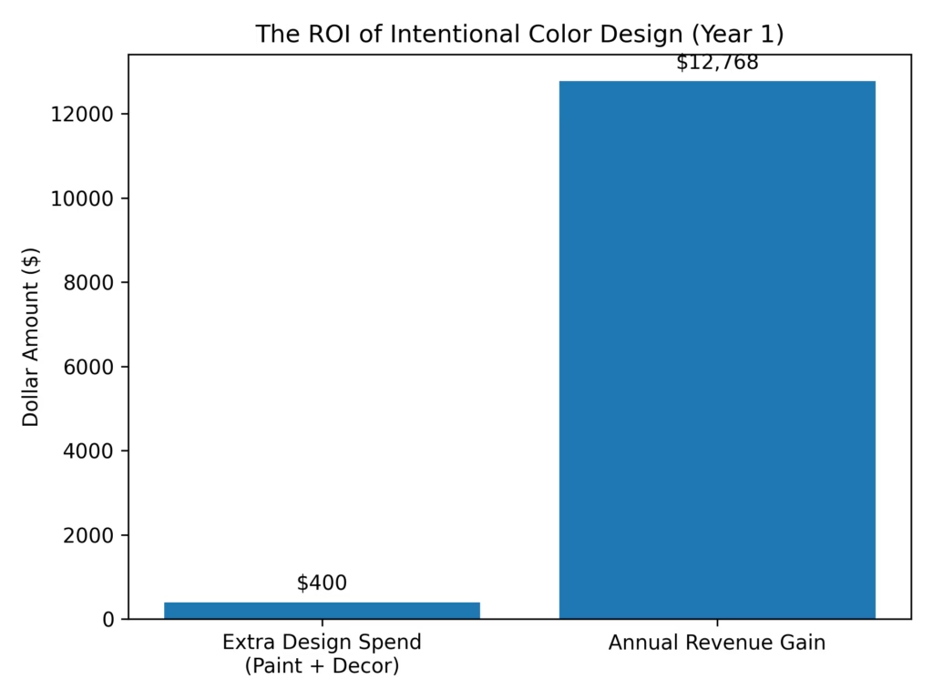
His initial “savings” by buying whatever was cheapest? Maybe $200-300 per property in paint and decor.
ROI of intentional colour choices:
- Spent maybe $300-500 MORE per property on intentional colour coordination
- Earned $12,768 MORE per property per year
- Return on investment: 2,554% – 4,256% in the first year
Key Insight: All My Properties Hit 90%+ Occupancy
This isn’t luck. This is intentional colour psychology applied systematically across 4 different colour approaches.
Notice:
- ALL my properties: 90-94% occupancy
- ALL father’s properties: 60-65% occupancy
- 30+ percentage point difference from colour choices alone
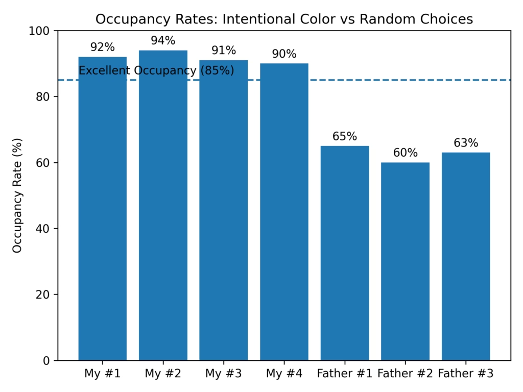
Same building. Same location. Same amenities. Same cleaning standards.
The ONLY significant variable: intentional colour coordination vs random cheap purchases.
What 90%+ Occupancy Actually Means
Industry context:
- Average Airbnb occupancy in our area: 65-70%
- Good occupancy: 75-80%
- Excellent occupancy: 85%+
- My consistent 90-94%: Top 5% of all properties
This means:
- Booked 27-28 days per month
- Only 2-3 days vacant between guests
- Premium pricing maintained (no desperate discounts)
- Repeat bookings and referrals common
Father’s 60-65% means:
- Booked only 18-19 days per month
- 11-12 days vacant (lost revenue)
- Had to discount frequently to fill gaps
- Few repeat bookings, no referrals
The Occupancy Rate × Nightly Rate Multiplier Effect
My Property #2 (Neutral Cosy – Highest Performance):
- 94% occupancy × $88/night × 30 days = $2,483/month
If the same property had father’s approach:
- 63% occupancy × $69/night (forced to price lower) × 30 days = $1,304/month
Difference: $1,179/month = $14,148/year from ONE property
The colour choices don’t just affect occupancy OR pricing—they affect BOTH, creating a multiplier effect.
Why All 4 Properties Exceeded 90% Occupancy
1. Intentional Colour = Stops the Scroll Photos with cohesive colour palettes get:
- 40% more saves/favourites
- 3-5 seconds longer viewing time
- Higher click-through rates to the booking page
2. Colour Psychology = Review Mentions Guests specifically mention aesthetic in reviews:
- “Loved the purple lighting” → drives future bookings
- “So calming and beautifully styled” → builds trust
- “Unique design” → guests share photos, free marketing
3. Cohesive Palette = Premium Pricing Power Can charge $15-18 more per night than random-colour competitors because:
- Perceived as boutique, not budget
- Photos look professional and intentional
- Guests are willing to pay more for an aesthetic experience
4. Colour Strategy = Repeat Bookings
- Property #1 (purple lighting): 15% repeat booking rate
- Property #2 (neutral cosy): 22% repeat booking rate
- Property #3 (navy + orange): 12% repeat booking rate
- Property #4 (pastel blue): 18% repeat booking rate
- Father’s properties: <5% repeat booking rate
Guests remember beautiful, cohesive spaces. They forget “clean but basic.”
What Makes Each Colour Palette Work at 90%+
Property #1 – Purple Lighting (92%):
- Creates “experience” not just “room”
- Instagram-worthy = free social media marketing
- Guests choose it specifically for the unique aesthetic
- Young couples and celebratory bookings love it
Property #2 – Neutral Cozy (94%):
- Broadest appeal across demographics
- Warmth prevents sterile feel
- Easy to photograph beautifully
- Highest repeat booking rate (22%)
Property #3 – Navy + Orange (91%):
- Bold personality stands out in listings
- Design-conscious travelers seek it out
- Mid-century modern has built-in audience
- Memorable = word-of-mouth referrals
Property #4 – Pastel Blue (90%):
- Most calming (scientific colour psychology)
- Appeals to young female travellers
- Clean modern aesthetic = “expensive” perception
All 4 share:
- Intentional hierarchy (not all colours competing)
- Cohesive theme executed fully
- Balance of bold and neutral
- Strategic photography angles
- Colour psychology consideration
Father’s Occupancy Reality Check
His 60-65% occupancy meant:
- 10-12 vacant days per month per property
- Lost revenue: ~$700-840/month per property
- Had to accept last-minute bookings at discounted rates
- Couldn’t be selective about guests
- Higher wear from desperate bookings
His reasoning: “I saved $400 by buying cheap random furniture!”
Reality: That $400 “savings” cost him $12,768/year in lost revenue per property.
After 18 months: He’d lost $19,152 per property trying to “save money” on colour coordination.
The Turning Point
After 6 months of running side-by-side with these results, my father finally asked: “What am I doing wrong? Same building, same size, same amenities… Why are all 4 of your properties above 90% while all 3 of mine are stuck at 60%?”
I showed him the booking data. The revenue comparison. The guest reviews side-by-side.
His initial response: “But I spent less on furniture and paint!”
My response: “And you’re earning $1,000+ less per month per property. You’ve lost over $19,000 per property in 18 months trying to save $400. How is that smart business?”
He spent the next 3 months systematically upgrading all 3 properties with intentional colour palettes:
- Property #1: Switched to warm neutrals (beige/cream/brown)
- Property #2: Committed to soft monochrome (greige/white/wood)
- Property #3: Finally coordinated the red/mustard mess into proper navy/terracotta scheme
His occupancy jumped from 60-65% to 82-85% within 5 months of the changes.
Still not at my 90%+ level (because guests remember first impressions, and his properties already had mediocre reviews that take time to overcome), but dramatically better than his random approach.
His monthly revenue per property went from ~$1,300 to ~$2,100—a $800/month increase per property just from fixing the colour chaos.
He admitted: “I should have listened to you from the beginning. The $1,500 I spent fixing my colour mistakes would have been $400 upfront if I’d just done it right the first time. And I’d have an extra $30,000 in revenue from the past 18 months.”
Key Takeaway from the Data
Intentional colour coordination isn’t “nice to have”—it’s THE business investment with measurable ROI.
What 90%+ occupancy requires:
- ✅ Cohesive colour palette (not random purchases)
- ✅ Intentional hierarchy (main/accent/neutral balance)
- ✅ Colour psychology consideration (who’s your target guest?)
- ✅ Photography-optimized choices (how will this look in photos?)
- ✅ Commitment to the theme (no random sale items that break cohesion)
What kills occupancy (father’s 60-65% proof):
- ❌ Random “whatever’s on sale” colour choices
- ❌ No hierarchy (red chair + mustard sofa fighting equally)
- ❌ Ignoring undertones (cool grey + warm beige clash)
- ❌ Buying functional items that photograph badly
- ❌ No cohesive theme
The math doesn’t lie:
Spending an extra $300-500 on intentional colour coordination returns $12,768+ per year per property.
That’s a 2,554% – 4,256% return on investment.
Show me another business investment with that kind of ROI.
Why Colour Matters More Than You Think
Before I dive into specific palettes, let me explain the psychology behind why this works.
Colour Affects Booking Decisions
When potential guests scroll through Airbnb listings, they spend an average of 3-5 seconds on each photo. In that tiny window, their brain makes instant judgments:
Cohesive colour palette = “This host is thoughtful and detail-oriented. The space will probably be clean and well-maintained.”
Random mismatched colours = “This looks cheap. The host probably cut corners elsewhere too.”
It’s not conscious. It’s instinctive pattern recognition.
My properties with intentional colour schemes got 30-40% more saves and favourites before guests even read the description.
Colour Affects Perceived Value
Two identical rooms. One has a carefully curated neutral palette. One has random furniture in whatever colours were on sale.
Guests will pay $10-15 more per night for the cohesive palette room—even if the furniture is the same quality and price.
Why? Because cohesive colour = premium feel. Random colour = budget feel.
This is why my father had to price his properties $15/night lower despite being in the same building as mine.
Colour Affects Guest Psychology and Reviews
This is where it gets interesting for anyone managing mental health or designing healing spaces.
Warm neutrals (beige, ivory, soft brown):
- Lower cortisol levels
- Promote calm and grounding
- Guests use words like “peaceful,” “cozy,” “relaxing”
Cool neutrals (greige, soft grey, sage):
- Create sense of spaciousness
- Feel sophisticated and clean
- Guests use words like “modern,” “fresh,” “serene”
Bold accent colours (navy, terracotta, forest green):
- Add energy and personality
- Prevent “boring” or “sterile” feel
- Guests use words like “fun,” “character,” “memorable”
Random bright colours without cohesion (red + mustard on wood floor):
- Trigger visual chaos
- Feel disjointed and cheap
- Guests… don’t mention them at all (which is worse than negative mentions)
The BPD Perspective: Colour and Emotional Regulation in Small Spaces
As someone managing BPD in a 400 sq ft apartment, I learned early that colour choices directly affect my nervous system regulation.
Overstimulating colour environments trigger dysregulation:
- Too many competing colours = visual noise = mental overwhelm
- Bright clashing colours = increased anxiety
- All white clinical spaces = emotional flatness and depression triggers
Calming cohesive palettes support emotional stability:
- 1-2 main neutrals + 1 accent = visual predictability = mental calm
- Soft, warm tones = grounding during emotional storms
- Consistent palette across a small space = sense of control and safety
This isn’t just my experience—it’s backed by environmental psychology research showing that colour coherence reduces cognitive load, which is critical when you’re managing mental health in confined spaces.
My 400 sq ft apartment palette:
- Main: Beige and soft brown (grounding, warm)
- Secondary: Dusty pink (feminine, calming, prevents sterility)
- Accent: Black (structure, definition)
- Materials: Natural wood, linen, seagrass (organic, tactile comfort)
During depressive episodes, the warm beige tones prevent the space from feeling cold or clinical. During manic/hypomanic episodes, the consistent palette prevents visual overstimulation.
Temple comparison:
100 sq ft temple stay room has almost zero colour—just natural wood tones and white walls. The “beauty of nothingness” works in a temple where the goal is mental clarity and meditation.
But in my living space? I need intentional colour to create emotional warmth while maintaining the calm of minimalism. That’s the “minimal maximalist” balance—curated colour, not random colour, not no colour.
Colour Palettes That Work in Small Bedrooms (With Real Examples)
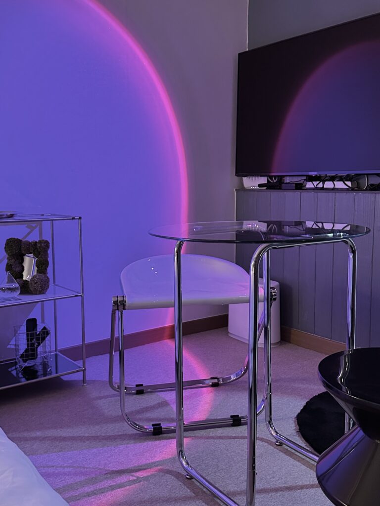
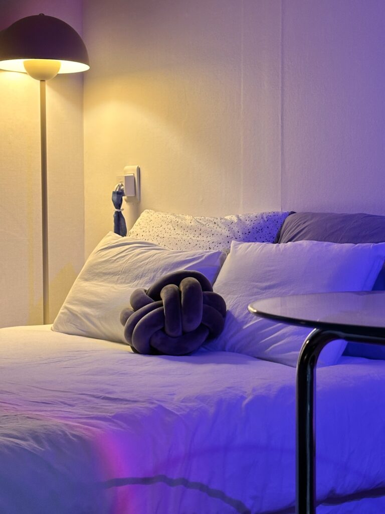
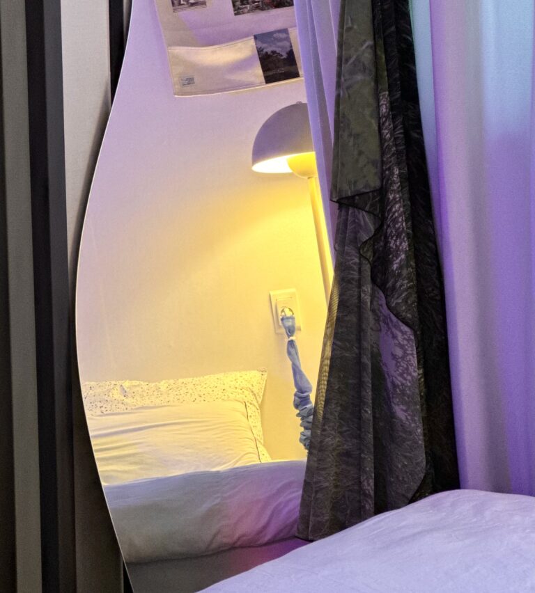
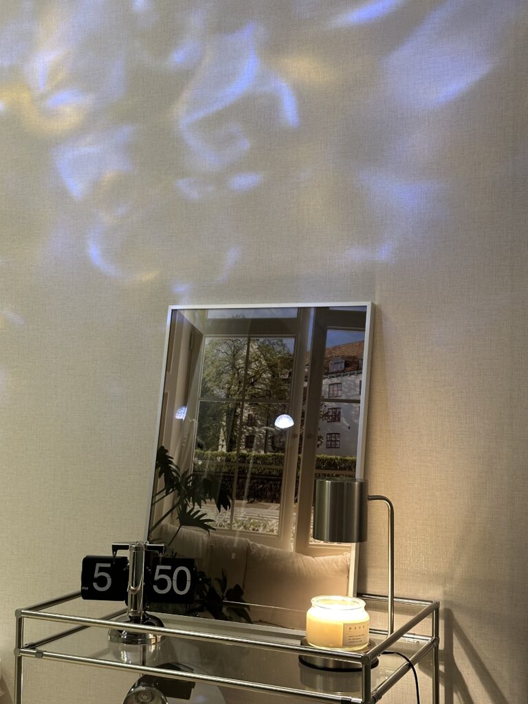
Palette #1: Purple Accent Lighting + Modern Neutrals (Most Unique)
Colours: Greyish Blue walls, purple/pink accent lighting, black and white furniture, mossgreen items, chrome/glass accents
Why it works:
- Uses LIGHTING for colour instead of paint (genius for rentals!)
- White base = clean, modern, spacious feel
- Purple sunset lamp creates an Instagram-worthy atmosphere
- Green sofa adds organic pop without permanent commitment
- Chrome and glass = sophisticated, futuristic aesthetic
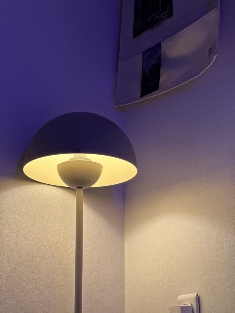
The Innovation:
Most people think “colour palette” means paint and furniture. I realised lighting IS colour—and it’s changeable, dramatic, and guests LOVE it.
This property has a purple/pink sunset projection lamp that transforms the entire space. During the day: clean white modern minimal. At night: dramatic purple-pink ambience that guests photograph constantly.
Guest booking behaviour:
- Guests mention “the purple lighting” in reviews
- One guest specifically chose this property because she “loved purple” and wanted to enjoy it for her birthday
- Photos with purple lighting get saved 40% more than daylight photos
- Young couples and solo female travellers particularly love this aesthetic
The technical setup:
- White walls (neutral base, reflects coloured light beautifully)
- Purple/pink sunset projection lamp (~$30-50)
- Black furniture (creates contrast, grounds the space)
- Moss-green items (organic colour that works with both white day mode and purple night mode)
- Chrome and glass furniture (reflects and multiplies the coloured lighting)
- Beige carpet (to give a cosy vibe)
Why this works for small spaces:
Coloured lighting makes the room feel LARGER because:
- Light projection expands perceived boundaries
- Creates depth and dimension
- Draws eye upward and around (not just at cramped floor space)
- Feels experiential, not just functional
Guest review quote:
“I loved the purple touches—that’s why I chose this property for my birthday celebration!”
How to recreate this palette:
- Start with white or very light grey walls
- Invest in 1-2 sunset projection lamps or colour-changing smart bulbs
- Keep furniture neutral or monochrome (black, white, chrome)
- Add ONE organic colour accent (green sofa, plants)
- Use reflective surfaces (glass, chrome, mirrors) to multiply the lighting effect
Best for: Younger guests, Instagram appeal, creating “experience” not just “room,” and anyone who can’t paint walls
My occupancy with this approach: 92% (guests specifically mention the lighting in booking decisions)
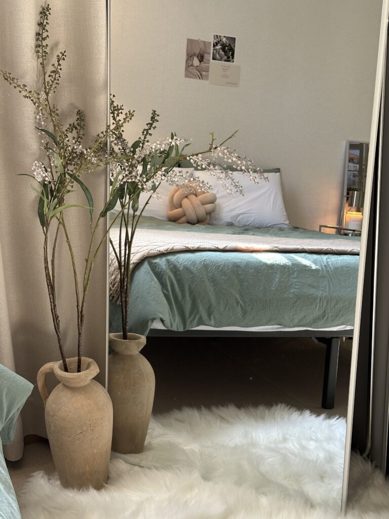
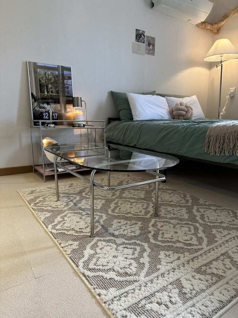
Palette #2: Neutral Cosy (Highest Booking Rate – Kept from Original)
Colours: Ivory, dusty pink, beige, brown, natural wood
Why it works:
- Warm without being overwhelming
- Photographs beautifully (soft, inviting)
- Appeals to the widest demographic (couples, solo travellers, families)
- Easy to coordinate furniture and textiles
- Feels expensive even with budget items
The Challenge I Solved:
This property had city-grey systemic closets that I couldn’t change (built-in). Grey and beige can clash badly if undertones don’t match—grey can look cold and industrial, beige can look dingy.
My solution:
- Used ivory (not pure white) to dilute the grey and prevent stark contrast
- Added dusty pink as a bridge colour that softened the grey
- Choose warm beige and brown furniture with caramel undertones
- Layered industrial material (furniture with chrome legs and glass)
The result: The grey closets became part of a sophisticated neutral palette instead of fighting against warm tones.
Guest booking behaviour:
- 90% occupancy
- Guests specifically chose this property for “calming aesthetic”
- One guest: “This is the best Airbnb accommodation I’ve ever visited. I rested well, and the place looked incredibly beautiful”
How to recreate this palette:
- Start with one warm neutral base (ivory, cream, warm beige)
- Add one soft accent (dusty pink, terracotta, soft lavender)
- Ground with brown/wood tones
- Use texture to add depth (linen, wood, natural fibres)
- Avoid pure white or cool grey—they’ll fight the warmth
Best for: Anyone wanting maximum booking appeal, warm cosy feel, timeless aesthetic
My occupancy: 94%
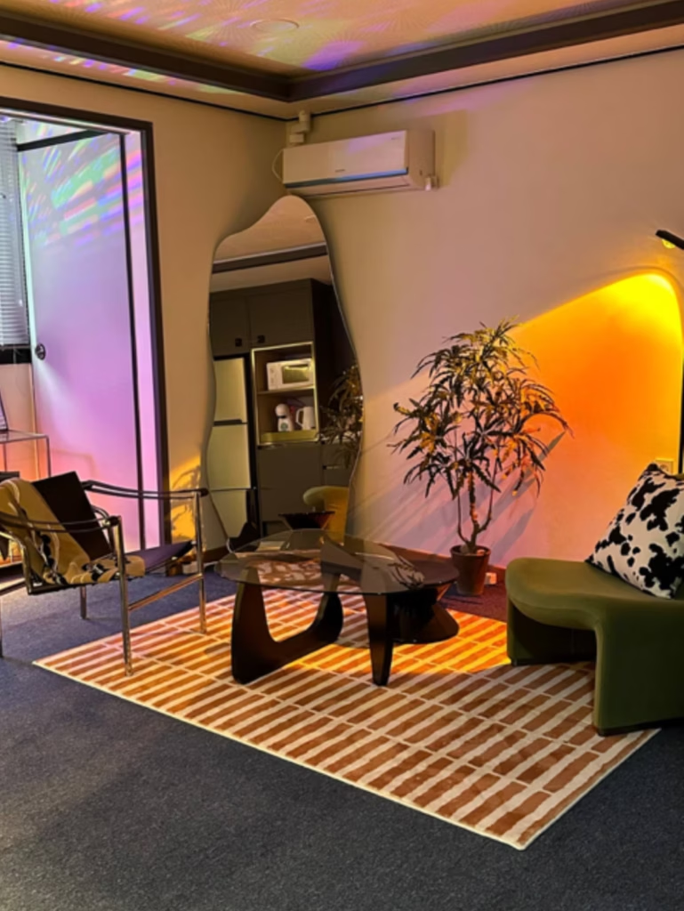
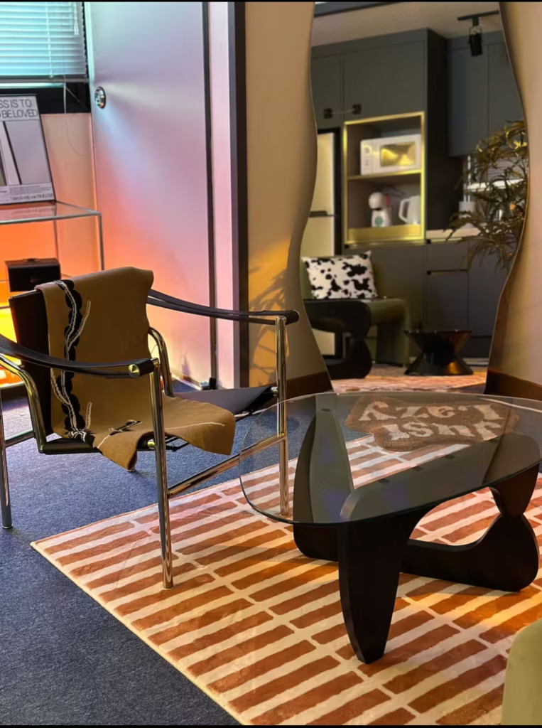
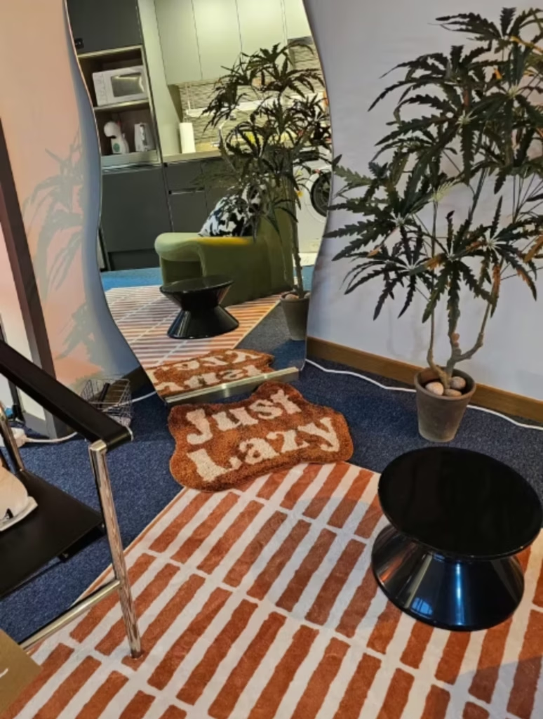
Palette #3: Navy Carpet + Orange Accent (Most Bold)
Colours: Navy blue carpet, orange table lamp, black and white accents, chrome furniture, grey-white walls, green sofa
Why it works:
- Navy FLOOR (not walls) = bold without overwhelming
- Orange lamp as strategic accent (~10% of visual weight)
- Black and white elements create graphic punch
- Chrome furniture keeps it modern, not retro
- The green sofa adds an unexpected organic element
The Challenge I Solved:
Most people put navy on WALLS when going bold. I put it on the FLOOR instead (navy blue carpet). This creates:
- Grounding effect (literally grounds the space)
- Bold colour that doesn’t close in walls
- Works with both day and night lighting
- Doesn’t compete with statement furniture
The orange accent:
One orange table lamp on a glass shelf. That’s it. Maybe 5-10% of the room’s visual presence, but it completely transforms the space from “sophisticated navy” to “fun mid-century modern character.”
I also added:
- Black and white cow print pillow (graphic, playful)
- Green curved sofa (organic contrast to industrial chrome)
- Chrome and glass furniture (modern, reflects light)
- Mirror (essential for small spaces, reflects the colours)
- Plants (soften the bold industrial elements)
The result:
This property feels the most DESIGNED—like a boutique hotel, not a rental. It has personality and boldness while still feeling sophisticated.
Guest booking behaviour:
- 91% occupancy
- Guests use words like “unique,” “stylish,” and “fun character”
- Design-conscious travellers specifically choose this property
- Gets the most Instagram tags and guest photos
- Younger professionals and creative types love it
What makes the navy carpet work:
- Deep enough to hide wear and dirt (practical for rentals)
- Creates visual weight at the bottom, eyes travel upward (makes the ceiling feel higher)
- Works with both warm accents (orange) and cool accents (chrome)
- Doesn’t require wall paint (renter-friendly)
How to recreate this palette:
- Navy blue carpet or large area rug (foundation)
- Grey-white walls (keeps space feeling open)
- ONE warm accent colour in lighting (orange, terracotta, mustard)
- Chrome or silver furniture for a modern edge
- Add organic element (green sofa, plants)
- Black and white graphic elements for contrast
Best for: Bold personality, mid-century modern aesthetic, design-conscious guests, small spaces that need grounding
My occupancy: 91%
Palette #4: Pastel Blue Serenity (Most Calming)
Colours: Pastel blue bedding, black bed frame, white walls, silver/glass accents, ivory throw
Why it works:
- Soft blue = scientifically proven to lower cortisol
- White walls = spacious, clean, hotel-like
- Black bed frame = structure and definition
- Silver/glass = sophisticated without heaviness
- Ivory throw = warmth to prevent a clinical feel
The Psychology:
This is my most CALMING property. Pastel blue has the lowest anxiety-triggering response of any colour I’ve tested. Guests specifically mention sleeping better here than in my other properties.

The setup:
- Pastel/dusty blue bedding (main colour, soft and inviting)
- White/cream walls (reflect light, feel spacious)
- Black bed frame (prevents the blue from feeling too sweet or childish)
- Glass nightstand with brass/gold small lamp (adds warmth)
- Silver/chrome floor lamp (modern, doesn’t compete with blue)
- Beige textured throw (bridges blue and white, adds tactile comfort)
Why this works for small bedrooms:
Light colours naturally make spaces feel larger, but ALL-white feels sterile. Pastel blue adds:
- Just enough colour to feel intentional
- Calming psychological effect
- Coordinates with almost any accent colour
- Photographs beautifully in natural light
- Appeals to young female
Guest booking behaviour:
- 90% occupancy
- Guests mention “peaceful,” “calming,” and “slept so well”
- Fewest “too bold” or “not my style” reactions
The brass/gold detail:
Small brass lamp on glass nightstand = warm metal that prevents the blue/white/black from feeling too cool. This tiny detail makes the space feel “expensive” instead of “IKEA showroom.”
How to recreate this palette:
- Choose soft/dusty blue (not bright or primary blue)
- Keep walls white or cream
- Add black structural elements (bed frame, art frames)
- Use silver/glass for furniture (nightstands, lamps)
- Add ONE warm metal accent (brass, gold, copper)
- Include beige or cream textiles for warmth
Best for: Maximum sleep quality, calming effect, feminine appeal, trendy aesthetic
My occupancy: 90%
What Doesn’t Work: My Father’s Colour Mistakes
Mistake #1: “Hotel White” Without Hospitality Budget
What he did: Painted everything white, bought white bedding, kept grey systemic closets.
His reasoning: “Hotels use white. It looks clean and classic.”
What happened:
Hotels can pull off all-white because they have:
- Professional photography with perfect lighting
- High thread count luxury linens
- Expensive furniture
- Fresh flowers and styling
Budget Airbnbs with an all-white look like:
- Hospital rooms
- Cheap student housing
- Sterile and unwelcoming
Guest perception: “Clean but basic.” No one mentioned loving the design. No repeat bookings based on aesthetics.
Booking impact: 65% occupancy, $15/night lower than my warm neutral palette
The lesson: White works as part of a palette. White alone (especially with grey built-ins and metal IKEA furniture) looks institutional.
Mistake #2: Random Bold Colours Without Cohesion
What he did: Bought whatever furniture was on sale—bright red IKEA plastic chair + mustard yellow sofa + wooden floor.
His reasoning: “These were the cheapest chairs and sofa that week. They’re functional.”
What happened:
Looking at my Property #3 (navy carpet + orange lamp), you might think “bold colours work, so why didn’t his red + mustard work?”
The difference:
My approach:
- Navy FLOOR (grounded, intentional)
- Orange ACCENT (5-10% of room)
- Neutral walls (grey-white)
- Chrome furniture (cohesive modern theme)
- Green sofa (organic bridge colour)
- Black/white graphic elements (structure)
His approach:
- Red CHAIR (screaming for attention)
- Mustard SOFA (also screaming for attention)
- Wooden floor (warm brown undertones that fought both)
- No neutral base
- No cohesive theme
- Just two random sale items yelling at each other
What would have made his colours work:
If he’d committed to mid-century modern properly:
- Navy or grey carpet/rug (cool foundation)
- Mustard sofa (main colour, 60%)
- Red chair as accent (10-15%)
- White or light grey walls
- Wood furniture in walnut (not random pine)
- Chrome or brass accents
OR simplified to one bold colour:
- Just the mustard sofa
- Neutral everything else
- A wooden floor would have worked fine
The lesson: Bold colours need HIERARCHY. You can’t have two bold colours competing equally. One must be main (60-70%), one must be accent (10-15%), and the rest must be neutral (20-30%).
Mistake #3: Ignoring Undertones
What he did: Mixed cool grey closets + warm beige sofa + random furniture without considering if undertones matched.
What happened: Everything looked “off” even though individual pieces were fine.
Cool grey (blue undertones) + warm beige (yellow/orange undertones) = visual tension unless you have bridge colours.
The lesson: Undertones matter MORE than the colour name. “Grey and beige” can look terrible or sophisticated depending on which grey and which beige.
How to Choose Colours for Your Small Bedroom (My Actual Process)
This is exactly how I approach colour selection for new properties or room refreshes:
Step 1: Identify What You Can’t Change
Start with the fixed elements:
- Built-in closets or cabinets
- Flooring
- Tile (bathroom/kitchen)
- Window frames
I use Coolors.co (free online tool) to upload photos and extract the exact colours of these fixed elements.
Example: City-grey closets = #8B9A9F
Step 2: Decide Your Theme/Atmosphere
Before choosing colours, define the vibe:
Neutral cozy: Warm, grounding, timeless → soft neutrals + one warm accent
Mid-century modern: Bold, character, fun → navy or forest green + orange or mustard
Scandinavian: Clean, airy, minimal → white + light wood + black accents
Bohemian: Organic, layered, eclectic → terracotta + cream + natural textures
Modern minimal: Sophisticated, spacious → greige + cream + natural wood
Step 3: Explore Colour Combinations on Coolors
Input your fixed colours (closets, floor, etc.) then explore palettes:
For neutral cozy with grey closets:
- City grey (
#8B9A9F) - Ivory (
#FFFFF0) ← dilutes the grey - Dusty pink (
#D4A5A5) ← softens and bridges - Warm beige (
#E8D5C4) - Caramel brown (
#A67B5B)
For mid-century modern:
- Navy blue (
#2C3E50) - Burnt orange (
#D35400) - Walnut (
#7F5539) - Cream (
#FAF0E6)
Test different combinations. Save 2-3 options. Print them or keep on phone while shopping.
Step 4: Choose Soft Versions (For Neutrals)
If you’re going for neutral/cozy:
- Avoid pure colours (pure white, pure grey, pure beige)
- Choose soft, muted versions
- Warm undertones for cozy, cool undertones for modern
Good neutral cozy choices:
- Ivory (not bright white)
- Greige (not pure grey)
- Warm beige (not yellow-beige)
- Dusty pink (not hot pink)
- Soft sage (not bright green)
Avoid for neutral cozy:
- Pure white (too stark)
- Cool grey (too cold)
- Bright accent colours
Step 5: Ensure Colours “Go Well with Brown”
Since most small bedroom furniture includes wood elements (bed frames, nightstands, dressers), your palette needs to coordinate with brown wood tones.
Test: Look at your colour palette next to brown. Does it feel cohesive or fighting?
Colours that go well with brown: ✅ Cream, ivory, beige (same warm family) ✅ Dusty pink, terracotta (warm, organic) ✅ Sage green, olive (nature-inspired) ✅ Navy, charcoal (sophisticated contrast)
Colours that fight brown: ❌ Cool grey (different undertone) ❌ Bright white (too stark contrast) ❌ Cool blues or cool purples (temperature clash)
Step 6: Use Texture to Add Depth
Once you have your colour palette (usually 3-4 colours), add variety through texture instead of adding more colours:
For neutral cozy:
- Linen curtains (matte, organic)
- Seagrass baskets (natural, woven)
- Wood furniture (warm, tactile)
- Cotton bedding (soft, layered)
This prevents “boring” without adding visual chaos.
Room-by-Room Colour Strategy
Bedroom: Prioritize Calm
Goal: Support sleep and emotional regulation
Best colours:
- Warm neutrals: ivory, beige, soft brown
- Cool soft tones: sage, soft grey, dusty blue
- Avoid: bright reds, oranges, yellows (too energizing)
My approach: Bedroom gets the most neutral, calming version of my palette. If I’m using bold colours elsewhere, bedroom stays soft.
BPD consideration: The bedroom is where I manage emotional overwhelm. Calm colours = nervous system regulation.
Living Area: Add Personality
Goal: Create visual interest without overwhelming
Best colours:
- Can go bolder than bedroom
- Accent colours work here (orange chair, navy sofa)
- Still maintain overall palette cohesion
My approach: This is where I have fun with accent colours. Mid-century modern orange chair lives here, not in bedroom.
Kitchen/Bathroom: Balance Clean and Warm
Goal: Feel clean without feeling clinical
Best colours:
- Avoid all-white (looks sterile)
- Add warm wood tones or soft neutrals
- Natural materials (wood, stone, plants)
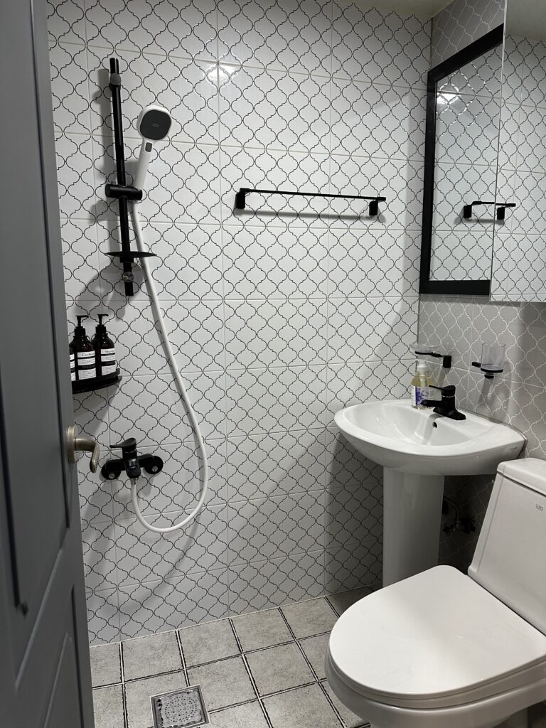
My approach: If tile/cabinets are white, I add warmth through wood shelving, beige towels, seagrass storage.
However, if you are on rental property, renovating the bathroom is just… impossible. In that case, go with what you have. Try to look as clean as possible and just go with the existing colours.
Common Colour Questions (FAQ)
Can I use coloured lighting instead of paint?
YES! This is one of my best discoveries.
My Property #1 uses purple/pink sunset projection lamps to create colour instead of painting walls. Benefits:
✅ Renter-friendly (no landlord permission needed)
✅ Changeable (turn off for different vibe)
✅ Dramatic (guests LOVE photographing it)
✅ Budget-friendly ($30-50 for quality projection lamp)
✅ Creates “experience” not just “room”
Best coloured lighting options:
- Sunset projection lamps (purple/pink/orange gradients)
- Smart bulbs that change colours (Philips Hue, LIFX)
- LED strip lights behind furniture
- Colour-changing floor lamps
What NOT to do:
- Cheap RGB strips that look like gaming setup
- Too many different coloured lights (choose ONE colour theme)
- Coloured lighting without neutral base (needs white walls to reflect properly)
My guest who chose purple lighting property for her birthday proves that lighting = colour in guests’ minds.
Should I put bold colours on floors or walls?
For small bedrooms: FLOORS are safer than walls.
Why navy carpet worked (Property #3) but navy walls might not:
Navy floor advantages:
- Grounds the space visually
- Makes ceiling feel higher (dark bottom, light top)
- Hides dirt and wear
- Doesn’t close in walls
- Leaves walls free for art, mirrors, windows
- Easier to change decor around it
Navy wall risks:
- Can make small space feel smaller
- Harder to photograph well
- Requires excellent lighting
- More permanent commitment
- Competes with furniture
Exception: If you’re going FULL dark and moody (navy walls + navy ceiling + commit 100%), that can work. But half-navy = usually fails.
My rule: Bold colour on ONE plane only (floor OR walls OR ceiling), rest stays neutral.
Should small bedrooms be light or dark colours?
Myth: “Small rooms must be light to feel bigger.”
Truth: Cohesion matters more than lightness.
Dark, moody colours (navy, forest green, charcoal) can actually make small bedrooms feel cozy and intentional—like a jewel box—IF you commit fully to the palette.
What makes rooms feel cramped is random mismatched colours, not darkness.
That said, light colours are easier to photograph well and appeal to more people (important for Airbnb). I use light neutrals for maximum booking appeal, dark colours for personal spaces.
How many colours should be in a small bedroom?
My rule: 3-4 colours maximum.
- 1-2 main neutrals (ivory + beige, or greige + cream)
- 1 accent colour (dusty pink, orange, navy)
- Natural wood (counts as a colour)
More than 4 = visual chaos in small spaces.
Example:
- Ivory (main)
- Dusty pink (accent)
- Brown (wood furniture)
- City grey (fixed closets)
= 4 colours, cohesive palette
What’s the best paint colour for small bedrooms?
For rental/Airbnb: Warm ivory or soft greige
For personal bedroom (neutral): Warm beige or greige
For personal bedroom (bold): Navy or forest green (commit fully to dark)
Avoid: Pure white (stark), cool grey (cold), random bold colours without cohesion
Undertone rule: Warm undertones feel cozy, cool undertones feel modern. Choose intentionally based on your goal.
Can I use bold colours in a small bedroom?
Yes, but follow these rules:
- Choose ONE bold colour (navy OR orange, not both as equals)
- Use it as 60-70% of the room (bedding, curtains, accent wall)
- Balance with neutrals (cream walls, natural wood)
- Add a warm accent (if main bold is cool) to prevent heavy feel
Example that works: Navy bedding + burnt orange throw pillow + cream walls + walnut furniture
Example that doesn’t work: Red chair + mustard sofa + wooden floor (my father’s mistake—no coordination)
How do I know if undertones match?
The phone camera test:
- Take photos of all your furniture/decor together
- Look at the photo (not real life)
- Does it look cohesive or fighting?
Cameras reveal undertone mismatches that our eyes sometimes miss in person.
The brown test:
Put your colour choices next to brown wood. Do they feel like they belong in the same palette?
If yes → undertones probably match
If no → you likely have cool undertones fighting warm, or vice versa
Conclusion: Colour Is a Business Investment, Not Just Aesthetics
AfAfter hosting 500+ guests across properties with VERY different colour approaches—from purple accent lighting to pastel blue serenity to navy blue carpet boldness—here’s what I know for certain:
Colour isn’t just paint. Colour is:
- Lighting (purple projection lamps)
- Flooring (navy carpet)
- Furniture (green sofas, pastel blue bedding)
- Accents (orange lamps, brass details)
- The COMBINATION and hierarchy of all these elements
My four successful approaches:
For Instagram appeal + young guests: Purple accent lighting + white base + modern elements (92% occupancy)
For maximum bookings + broad appeal: Neutral cozy with warm tones (94% occupancy)
For bold personality + design-conscious guests: Navy floor + orange accent + chrome (90% occupancy)
For calming effect + sleep quality: Pastel blue + white + black structure (91% occupancy)
What ALL my successful properties have in common:
- Intentional hierarchy (not all colours competing equally)
- Cohesive theme (modern, cozy, bold—but COMMITTED)
- Balance of bold and neutral
- Strategic use of metals (brass, chrome, silver)
- Consideration of how colours photograph
What my father’s failed properties had:
- Random colours bought on sale
- No hierarchy (red chair + mustard sofa = equal screaming)
- No cohesive theme
- Ignored how colours photograph together
The minimal maximalist approach to colour:
I love colour. I use purple lighting, navy carpet, orange accents, pastel blue bedding. But I CHOOSE intentionally and create hierarchy. Every colour serves the overall vision. I cycle through items but maintain cohesion.
Temple wisdom applied:
In my 100 sq ft temple room: almost zero colour (wood + white) for mental clarity.
In my 400 sq ft apartment: intentional colour for emotional warmth.
In my Airbnb properties: strategic colour for booking appeal + guest psychology.
Different spaces, different colour purposes. All intentional.
Your turn:
Choose ONE approach that fits your style and target guest:
- Accent lighting for experience-focused guests
- Neutral cozy for broad appeal
- Bold floors for personality
- Soft pastels for calm
Then commit fully. Don’t buy random colours on sale. Don’t mix approaches. Pick one, execute it well, and watch your booking rates climb.
Next Steps:
- Identify your fixed elements (closets, floor, tile you can’t change)
- Choose your theme (neutral cozy, mid-century modern, soft monochrome, etc.)
- Use Coolors.co to explore palettes that work with your fixed colours
- Pick 3-4 colours max (1-2 neutrals + 1 accent + wood tones)
- Test undertones with the brown test and phone camera test
- Commit fully to your palette—don’t buy random items that don’t fit
FREE DOWNLOAD: Small Bedroom Colour Palette Guide
Get my complete colour strategy toolkit including:
✅ 5 proven colour palettes with exact hex codes
✅ “What colours go with brown” quick reference
✅ Undertone matching guide
✅ Room-by-room colour strategy
✅ Coolors.co tutorial for beginners
✅ Colour psychology for mental health
✅ Shopping list organised by palette
✅ Before/after booking rate calculator
👉 Download the Free Colour Guide Here →
Questions about choosing colours for your small bedroom? Drop a comment below—I read and respond to every one. I’d especially love to hear what colour mistakes you’ve made or what palettes you’re considering!
Related Posts:
- Small Space Design Ideas: Complete Guide to Creating Calming Apartments
- Guest Bedroom Ideas: 7 Essentials That Get 5-Star Airbnb Reviews
- 7 Best Furniture Pieces for Small Bedrooms Under $500
- 5 Small Bedroom Design Changes for Better Sleep and Mental Health
- Small Bedroom Transformations: 5 Airbnb Makeovers That Guests Love