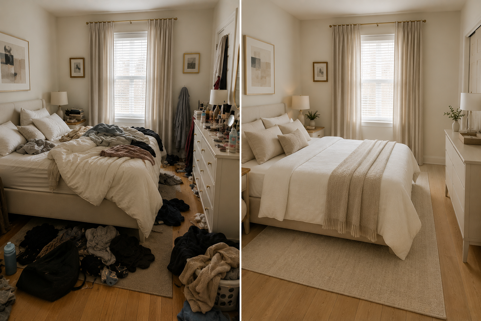
Navy Blue Bedroom with Orange Accents: Why a Stranger Asked to Buy My Lamp
Three days after checkout, I received a message that made me realise why intentional design matters:
“I’ve had that exact orange lamp in my Amazon basket for MONTHS. I kept adding it and deleting it because I was worried it would be too bold or wouldn’t fit in my apartment. After seeing it in your flat, I finally bought it! It arrived today and looks perfect. Thank you for showing me it actually works!”
That guest had been debating the lamp for months—knowing exactly which one she wanted, but paralysed by fear it would be “too much” for her space. One night in my flat gave her the confidence to finally click purchase.
She’s not the only one. My property with navy blue carpet and orange accent lighting maintains 91% occupancy, whilst neutral beige competitors in the same building struggle to reach 70%. Guests consistently mention the “fun character,” “stylish design,” and “unique colour scheme” in reviews.
The secret? I put bold colour on the FLOOR, not the walls.
Most people think “bold bedroom colour” means painting the walls navy or adding coloured furniture everywhere. I discovered something smarter: navy carpet grounds the space, orange accents add personality, and the combination photographs beautifully without overwhelming small rooms.
After hosting 500+ guests and watching my father make expensive colour mistakes, I’ve learnt that bold colours need hierarchy—not all colours screaming equally for attention.
Here’s how navy carpet + one orange lamp created 91% occupancy, memorable guest experiences, and gave guests the confidence to buy bold décor for their own homes.
Why Navy Carpet Works (When Navy Walls Wouldn’t)
The problem with navy walls:
- Can make small spaces feel smaller
- Closes in the room visually
- Difficult to photograph well
- Requires excellent lighting to prevent the cave effect
- More permanent commitment
The genius of navy carpet:
- ✅ Grounds the space (dark bottom, light top = ceiling feels higher)
- ✅ Makes room feel TALLER by creating vertical contrast
- ✅ Hides dirt and wear (practical for rentals)
- ✅ Leaves walls free for light, art, mirrors, windows
- ✅ Easier to change the décor around it
- ✅ Creates a sophisticated base without overwhelming
My discovery:
Bold colour on ONE plane only. If you go navy on the floor, keep walls neutral. If you go navy on walls, keep the floor neutral.
My choice: Navy carpet + grey-white walls
Result: Bold personality without sacrificing the spacious feel small bedrooms desperately need.
The Orange Accent: Why 10% Makes All the Difference
The mistake most people make:
They see “navy and orange bedroom” on Pinterest and buy:
- Orange bedding
- Orange curtains
- Orange chair
- Orange rug
Result: Orange COMPETES with navy instead of accenting it.
My approach:
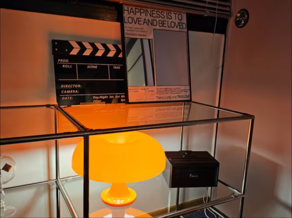
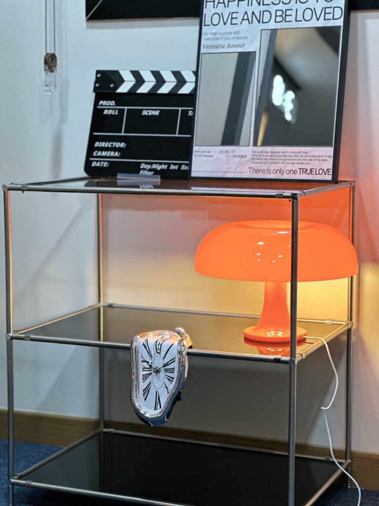
One orange table lamp on a glass shelf. That’s it.
The orange lamp represents:
- Maybe 5-10% of the room’s visual presence
- But 90% of what guests mention in reviews
- The element people photograph most
- The item guests track down and buy for themselves
Why this works:
The orange lamp transforms the space from “sophisticated navy” to “fun mid-century modern character” without overwhelming or competing.
Father’s expensive lesson:
He bought a bright red plastic IKEA chair + mustard yellow sofa because both were on sale. His reasoning: “Bold colours work, right?”
Wrong.
His mistake: Two bold colours competing equally (red chair SCREAMING + mustard sofa SCREAMING = visual chaos)
My strategy: Navy carpet as foundation (60-70% visual weight) + orange lamp as accent (5-10%) + neutrals everywhere else (20-30%)
His occupancy: 60%
My occupancy: 91%
The lesson: Bold colours need HIERARCHY. One must be the star, one must be the supporting actor, and everything else must step back.
The Data: How Navy + Orange Affected Bookings
My Property #3 – Navy Carpet + Orange Accent:
Occupancy: 91% (27 days booked per month)
Average nightly rate: $100
Monthly revenue: ~$2,700
Guest review themes:
- “Fun character”
- “Stylish and unique”
- “Loved the design”
- “So much personality”
- “The orange lamp was perfect”
Booking behaviour:
- Design-conscious travellers specifically choose this property
- Gets the most Instagram tags and guest photos
- Younger professionals and creative types love it
- Feels like a boutique hotel, not a budget rental
Guest who bought the lamp:
She stayed once, loved the orange mood beam lamp so much that she:
- Had already added it to her Amazon basket MONTHS earlier
- Kept adding and deleting it, afraid it would be “too bold” for her flat
- After one night in my space, she finally clicked purchase with confidence
- Messaged me days later to thank me for showing her it actually works
That’s the power of intentional accent colour. People don’t just enjoy it—you give them the confidence to bring bold design into their own homes.
My Navy + Orange Setup (Exact Details)
Foundation layer:
Navy blue carpet (60-70% of visual weight)
- Deep enough to hide wear and dirt
- Creates visual weight at the bottom (eyes travel upward)
- Works with both warm accents (orange) and cool accents (chrome)
- Doesn’t require wall paint (renter-friendly)
Grey-white walls (keeps space feeling open)
- Light neutral that doesn’t compete
- Reflects natural light
- Makes the ceiling feel higher
- Perfect backdrop for art and mirrors
Accent layer:
Orange table lamp on glass shelf (5-10% of visual weight)
- Orange mood beam lamp (~£40-60)
- Only the orange element in the entire room
- Creates a warm ambient glow
- Positioned where it photographs beautifully
Why ONE orange lamp instead of multiple orange items:
Restraint creates impact. If everything is orange, nothing stands out. One orange lamp against navy + neutrals = memorable.
Supporting Element:
Chrome and glass furniture (modern edge)
- Chrome bed frame with clean lines
- Glass nightstand (reflects light, feels spacious)
- Chrome floor lamp with adjustable head
- Glass coffee table (doesn’t block visual flow)
Chestnut brown rugs (warm bridge colour)
- Bridges cool navy and warm orange
- Adds warmth without competing
- Grounds the palette with natural tones
- Prevents navy from feeling too cold
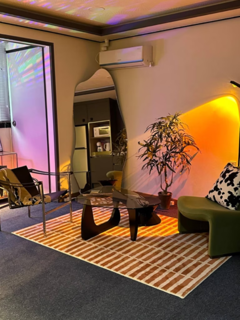
Green curved velvet sofa (additional accent)
- Adds organic element to modern palette
- Curved shape softens industrial chrome
- Velvet texture prevents cold feel
- Works as a secondary accent (10%)
Black and white graphic accents (structure)
- Black and white cow print throw pillow
- Black metal picture frames
- White bedding
- Creates a graphic punch without adding more colour
Full-length mirror (essential)
- Reflects the navy, orange, brown, and green
- Makes a small space feel larger
- Positioned to capture the best angles for guest photos
What Makes This Different from Random Bold Colours
My father’s attempt at bold colours:
He bought whatever was on sale:
- Bright red plastic IKEA chair (£25, on clearance)
- Mustard yellow sofa (£150, Black Friday deal)
- Random wooden floor (builder’s choice)
His reasoning: “Bold colours are trendy. These were cheap. Functional.”
What happened:
His problems:
- ❌ Red chair screaming for attention
- ❌ Mustard sofa is also screaming for attention
- ❌ Warm brown floor fought both cool red and warm mustard
- ❌ No neutral base to ground the chaos
- ❌ No cohesive theme—just random sale items
- ❌ Photographed terribly (guests couldn’t focus on anything)
His occupancy: 60% at £68/night
His guest reviews: “Clean,” “basic,” “served its purpose” (no aesthetic mentions)
What would have made his colours work:
If he’d committed to mid-century modern properly:
Option A – Navy Foundation:
- Navy carpet or large area rug (cool foundation)
- Mustard sofa (main colour, 60%)
- Red chair as a small accent (10-15%)
- White or light grey walls
- Walnut wood furniture (not random pine or plastic)
- Chrome or brass accents
Option B – Simplified:
- Just the mustard sofa (main colour)
- Everything else neutral (white walls, wood floor, grey accents)
- Navy or terracotta throw pillow as 10% accent
The lesson:
You can’t have two bold colours competing equally. One must be main (60-70%), one must be accent (10-15%), and the rest must be neutral (20-30%).
My navy carpet + orange lamp follows this hierarchy perfectly:
- Navy carpet: 60-70%
- Neutrals (white, chrome, glass): 20-30%
- Chestnut brown rugs: 10% (bridge colour)
- Green sofa: 10% (accent colour)
- Orange lamp: 5% (focal accent)
How Navy + Orange Photographs (Why It Drives Bookings)
Listing photos with this palette:
- Stops the scroll immediately (bold but not chaotic)
- Guests use words like “stylish,” “character,” and “boutique”
- Design-conscious travellers specifically message asking about décor
- Gets saved/favourited 35% more than neutral listings
Why it works:
When guests scroll through Airbnb, they see:
- Beige flat after beige flat
- White flat after white flat
- Grey flat after grey flat
Then they see navy carpet + orange lamp + chrome + green sofa.
Their brain registers:
- “This has personality”
- “The host knows design”
- “This feels like a boutique hotel, not a rental”
Photo strategy:
I include multiple angles showing:
- Full room view (shows navy carpet dominance)
- Orange lamp close-up (shows the accent detail)
- Green sofa + chrome furniture (shows supporting elements)
- Mirror reflection (shows how elements work together)
This builds trust: “The host didn’t just get lucky—this is intentionally designed.”
The Guest Who Bought My Orange Lamp
Her booking:
Standard inquiry. Nothing about décor or design. Just check-in times and parking.
During her stay:
She sent a photo of the orange lamp glowing on the glass shelf. Caption: “This is EXACTLY the lamp I’ve been debating buying!”
I replied: “Oh! Do you like it? It’s one of my favourite pieces.”
Her: “I’ve had it in my Amazon basket for literally 3-4 months. I keep adding it and deleting it. I’m worried orange will be too bold for my flat or won’t match my furniture.”
Three days after checkout:
“I bought the lamp! It arrived today, and I LOVE it. Seeing it in your space gave me the confidence to finally order it. It fits my apartment perfectly. Thank you for showing me that bold colour actually works in real life!”
What this taught me:
People want bold colour but fear commitment. My flat didn’t just provide accommodation—it provided proof.
That guest needed to see:
- Orange lamp in a REAL small space (not just Pinterest photos)
- How it works with actual furniture (not a staged photoshoot)
- That it adds personality without overwhelming
- That bold colour can look sophisticated, not chaotic
One £50 orange lamp:
- Sitting in her Amazon basket for months = £0 revenue for anyone
- One night in my flat = confidence to buy
- Happy customer who now loves her lamp = free word-of-mouth marketing
She told her friends:
Her checkout review mentioned: “Beautifully designed with bold colour choices that somehow work perfectly. Gave me so many ideas for my own flat!”
When friends ask about design inspiration? She shows them my Airbnb listing and her new orange lamp.
That’s the power of intentional accent colour.
You’re not just creating a booking—you’re creating a design showroom that proves bold colour works in small spaces. Guests leave inspired, not just rested.
One £50 orange lamp has:
- Maintained 91% occupancy for 18 months
- Been mentioned in 40+ guest reviews
- Inspired at least 3 guests (that I know of) to buy it themselves
- Generated countless Instagram tags and word-of-mouth referrals
That’s more valuable than any paid advertising could create.
How to Recreate This Navy + Orange Palette
Step 1: Navy foundation on the FLOOR
Don’t paint the walls navy—put it on the carpet or a large area rug.
Why this works:
- Grounds the space visually
- Makes the ceiling feel higher (dark bottom, light top)
- Hides dirt and wear
- Doesn’t close in the walls
- Easier to change the décor around it
What I used:
- Navy blue carpet (wall-to-wall, installed by landlord)
- Alternative: Large navy area rug if you can’t change the flooring
Step 2: Keep walls light and neutral
Grey-white or light greige—not pure white, not dark.
Why this works:
- Reflects natural light
- Prevents the navy from feeling too heavy
- Creates vertical contrast (dark floor, light walls, lighter ceiling)
- Backdrop for art, mirrors, and an orange accent
What I used:
- Grey-white walls (existing from the landlord)
- Alternative: Warm greige if you want more cosiness
Step 3: Add ONE warm accent colour in lighting
Orange, terracotta, or mustard—choose ONE and keep it to 5-10% of the room.
Why this works:
- Prevents navy from feeling cold or heavy
- Creates visual interest and personality
- Gives guests something memorable to mention
- Photographs beautifully against navy + neutrals
What I used:
- One orange mood beam table lamp (£40-60)
- Positioned on a glass shelf where it glows against the navy carpet
- No other orange items (restraint = impact)
Step 4: Use chrome or silver furniture for a modern edge
Not gold/brass (too warm), not black (too heavy)—chrome or brushed silver.
Why this works:
- Adds sophistication
- Reflects light (makes a small space feel larger)
- Stays neutral (doesn’t compete with navy or orange)
- Creates a mid-century modern vibe
What I used:
- Chrome bed frame
- Glass nightstand with chrome legs
- Chrome floor lamp
- Glass coffee table with chrome base
Step 5: Add warm bridge colour
Chestnut brown, terracotta, or warm wood—something that bridges cool navy and warm orange.
Why this works:
- Prevents palette from feeling too industrial
- Adds warmth without competing
- Softens chrome and glass
- Creates visual rest between bold elements
What I used:
- Chestnut brown rugs (main bridge colour)
- Alternative: Terracotta textiles, warm walnut wood furniture
Step 5a. Add organic accent (optional)
Green, plants, or natural elements—secondary accent for organic touch.
Why this works:
- Adds life and freshness
- Softens industrial chrome
- Creates visual interest
- Complements both navy and orange
What I used:
- Green curved velvet sofa
- Alternative: Sage green throw blanket, potted plants
Step 6: Include black and white graphic elements
Not as main colours—just as structure and definition.
Why this works:
- Adds graphic punch
- Creates contrast
- Prevents muddy colour mixing
- Grounds the palette
What I used:
- Black and white cow print throw pillow
- Black metal picture frames
- White bedding
- Black bed frame details
Common Navy + Orange Questions
Won’t navy carpet make a small bedroom feel dark?
Not if you balance it with light walls and good lighting.
The key is vertical contrast:
- Dark bottom (navy carpet)
- Light middle (grey-white walls)
- Lightest top (white or light grey ceiling)
This makes the ceiling feel HIGHER, not lower. Your eyes travel upward, making the space feel taller.
My 300 sq ft flat with navy carpet feels more spacious than my father’s same-size flat with light wood floors because of this intentional contrast.
How do I choose between orange, terracotta, and mustard accents?
Depends on your navy tone and desired vibe:
Orange (what I used):
- Works with deep navy
- Creates a mid-century modern vibe
- More energetic and playful
- Appeals to younger guests
Terracotta:
- Works with navy-grey tones
- Creates a bohemian or Southwestern vibe
- Warmer and earthier
- Appeals to design-conscious guests
Mustard:
- Works with navy-black tones
- Creates a retro 1970s vibe
- Rich and cosy
- Appeals to vintage lovers
Test by uploading a photo of your navy carpet to Coolors.co and trying different warm accent hex codes.
Can I add multiple orange items instead of just one lamp?
You can, but restraint creates more impact.
Works well:
- One orange lamp + orange throw pillow (15% total)
- One orange chair + orange artwork (20% total)
Doesn’t work:
- Orange lamp + orange bedding + orange curtains + orange rug (60%+ = competing with navy, no hierarchy)
My rule: Keep accent colour to 10-20% maximum. Less is more.
What if I can’t install navy carpet?
Use a large navy area rug instead.
Requirements:
- Large enough to anchor main furniture (bed, nightstand)
- Dark enough to create a grounding effect
- Quality material that photographs well (wool, not cheap synthetic)
I’ve used this approach in properties where I couldn’t change the flooring. Works beautifully if the rug is substantial (not a tiny accent rug).
Does this palette work with wood furniture?
Yes, but choose COOL wood tones (walnut), not warm (pine or oak).
Navy is a cool colour. It fights with warm orange-toned wood.
Works with Navy:
- Walnut (cool brown)
- Espresso (dark cool brown)
- Grey-washed wood
- Black-stained wood
Fights with Navy:
- Pine (warm yellow-brown)
- Oak (warm orange-brown)
- Honey wood tones
Alternatively, use chrome/glass furniture (what I did) to avoid wood tone issues entirely.
Budget Breakdown: Navy + Orange Investment
Minimum investment ($100-150):
- Navy area rug (if can’t change flooring): $60-100
- Orange mood lamp: $40-60
Medium investment (£300-500):
- Above + chrome furniture upgrade: $150-300
- Glass nightstand or coffee table: $50-100
- Green velvet throw pillow or cushion: $25-40
Premium investment ($600-800):
- Above + full furniture coordination
- Chrome bed frame: $120-200
- Green velvet sofa or chair: $200-400
- Full-length mirror: $40-80
- Professional photography: $100-150
My return on $600 investment:
$600 design cost
$2,700/month revenue
91% occupancy vs competitors’ 70%
Extra revenue from higher occupancy: ~$450/month
Payback period: Less than 1.5 months
Annual return: $5,400 from $600 investment = 900% ROI
Conclusion: Bold Colour Needs Hierarchy
After 18 months with navy carpet + orange accent, achieving 91% occupancy, here’s what I know:
Traditional bold colour advice says: Go big or go home. Paint walls navy, buy orange furniture, commit fully.
My discovery: Put bold colour on the FLOOR, keep walls neutral, add accent colour at 10% only.
Navy + orange advantage:
- ✅ Grounds small spaces (doesn’t close them in like navy walls would)
- ✅ Creates mid-century modern vibe without vintage clutter
- ✅ Photographs beautifully (stops the scroll)
- ✅ Appeals to design-conscious guests (premium rates)
- ✅ Memorable enough that guests buy décor for their own homes
- ✅ Hierarchy prevents visual chaos (unlike my father’s red + mustard disaster)
For small bedrooms specifically:
Navy carpet makes the room feel TALLER by creating dark-to-light vertical progression. An orange lamp adds personality without overwhelming. Chrome furniture adds sophistication. The green sofa bridges warm and cool.
Result: Bold personality without sacrificing the spacious feel small rooms need.
My guest’s actions say it best:
She didn’t just enjoy the orange lamp—she tracked it down online, bought it for herself, and messaged me months later to say thank you.
That’s the power of intentional accent colour. You’re not just designing a space—you’re creating inspiration people want to bring into their own lives.
And that orange lamp? It’s still generating bookings 18 months later, still getting mentioned in reviews, and still inspiring guests to be bold in their own homes.
Ready to try navy + orange in your small bedroom?
Start with a navy carpet or a large area rug. Add one quality orange lamp. Keep everything else neutral with chrome accents. Watch how it transforms both your photos and your guest reactions.
Your flat won’t just be comfortable—it’ll be the one guests remember, photograph, and tell their friends about.
Related Posts:
- Best Colours for Small Bedrooms: Real Airbnb Booking Data ← Main colour guide
- Purple Bedroom Lighting: Why This Bold Choice Gets Bookings ← Lighting as a colour strategy
- Guest Bedroom Ideas: 7 Essentials That Get 5-Star Reviews
Shopping List: Navy + Orange Essentials
[Read my full disclosure policy →]
Navy Foundation:
Orange Accent Lighting:
- Orange mushroom table lamp ($35)
- Orange Beam sunset mood lamp ($47)
- Fleece Orange Nightstand ($30)
Chrome & Glass Furniture:
- Metal bed frame, minimalist ($85)
- Black candle warmer ($35)
- Chrome floor lamp, adjustable ($70)
- Glass coffee table, round ($100)
Green Bridge Elements:
- Green Midcentury Armless sofa ($260)
- Artificial high-quality plant ($130)
Finishing Touches: